

Before Aura Dashboards I built our course analytics from scratch, mostly in Python, and then either shared the output with the team or had them log in to code I'd written. Now they log in to a dashboard. They access the data live through the Aura console.
Access to the data means they can solve problems they couldn't before. Support emails, requests, and the "I can't find my certificate" kind of query are now self-served within a dashboard that's available to the whole team.
These are the five cards I use most, and the Cypher behind them.
1. Sometimes all you need is a number
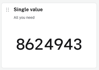
The single value card takes a Cypher statement that returns one row and one column.
RETURN COUNT { (:User) }This card shows the number front and center for all to see.
2. Inline comparisons with line charts
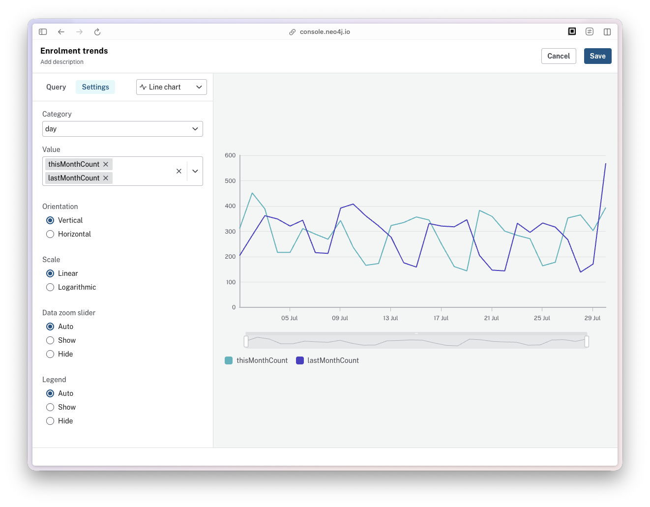
I often need to compare changes over time. The card I open first draws the last few weeks of enrollments and the few weeks before them as two lines, so I can see which way the numbers are going.
Each row the query returns is one day, with this period's count in one column and the previous period's count in another.
WITH $daysToShow as daysToShow

MATCH (e:Enrolment)
WHERE e.createdAt >= datetime() - duration({days: (daysToShow+2)*2})

WITH daysToShow, date(e.createdAt) AS date, duration.inDays(datetime.truncate('day', e.createdAt), datetime.truncate('day')).days AS days, count(*) AS count

WITH daysToShow, collect({
  date: date,
  days: days,
  count: count
}) AS days

UNWIND range(1, daysToShow) AS day
RETURN date() - duration({days: day}) AS day,
  [ row IN days WHERE row.days = day ][0].date AS thisMonthDate,
  [ row IN days WHERE row.days = day ][0].count AS thisMonthCount,
  [ row IN days WHERE row.days = day+daysToShow ][0].date AS lastMonthDate,
  [ row IN days WHERE row.days = day+daysToShow ][0].count AS lastMonthCount
ORDER BY day DESC
$daysToShow sets the length of each period. The query pulls (daysToShow+2)*2 days of enrollments, buckets them by how many days ago each one was created, then uses UNWIND to walk back a day at a time. thisMonthCount reads the count at that offset and lastMonthCount reads the same offset shifted by daysToShow, which is what lays one period on top of the other.
The card uses the day as the category and the enrollment count for each month as the values, so the two periods share an axis.
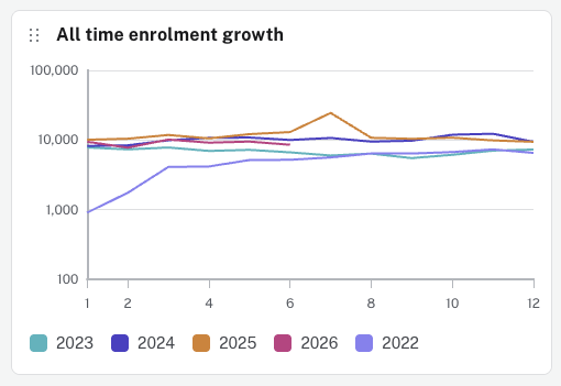
My "All time enrolment growth" card is a line chart with one series per year and months along the bottom.
3. Making a static dashboard dynamic with filters
$daysToShow comes from a filter card which turns a static dashboard into one that can be updated to answer different questions. You create a parameter, give it a default value, and the cards that reference it re-run when the value changes. Reducing the value to 7 turns a monthly view into a weekly one.
This can also be used for property lookups. On our Users dashboard, we use a filter to look up users by email address and display the information about that user below. Anyone answering a support email can look the learner up themselves instead of asking me to run a query.
4. Nothing beats a table
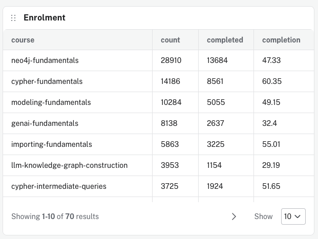
A table gives me the actual numbers rather than a chart I have to interpret. I can sort by any column, and the card splits the rest across pages.
The Enrolment table shows how many people have started each course and how many have finished it, which is how we tell which courses are working.
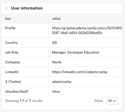
The properties of a node or relationship naturally are returned as rows in a table. We use this trick to unwind the list of property names, to reorient the data into rows and columns to work in the user view of our user dashboard.
MATCH (u:User {email: $email})
WITH u LIMIT 1

UNWIND [
  {
    key: 'Profile', // (1)
    property: 'id', // (2)
    prefix: 'https://graphacademy.neo4j.com/u/' // (3)
  },
  {key: 'Country',       property: 'country'},
  {key: 'Job Role',      property: 'role'},
  {key: 'Company',       property: 'company'},
  {key: 'LinkedIn',      property: 'linkedin'},
  {key: 'X (Twitter)',   property: 'twitter'},
  {key: 'Unsubscribed?', property: 'unsubscribed'}
] AS row

RETURN row.key AS key,
coalesce(row.prefix, '') + u[ row.property ] AS value- 1
propertyis the property to read on the node, andu[ row.property ]looks it up by name.
- 2
keyis what I want to display in the left column.
- 3
prefixprovides a string to be placed before the value.
5. Side by side comparisons with bar charts
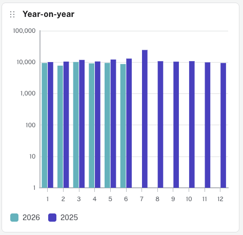
The line chart above looks great, but it hid a serious problem that I only spotted when I looked at the same data another way, using a bar chart. Displaying two values side by side made it obvious that we had a drop in numbers that needed to be addressed.
A decline in enrollment numbers wasn't apparent with all of those lines on the line chart, each one competing for attention.
Viewing the two numbers side by side made this discrepancy apparent.
This query counts enrollments by month, then returns one row for each of the twelve months with a column for 2025 and a column for 2026.
MATCH (e:Enrolment)
WHERE e.createdAt >= datetime.truncate('year') - duration('P1Y')
  AND e.createdAt <= datetime.truncate('month')
WITH e.createdAt.year AS year, e.createdAt.month AS month, count(*) AS count
WITH collect({year: year, month: month, count: count}) AS months

UNWIND range(1, 12) AS i

RETURN i AS Month,
  [ n in months where n.year = 2025 and n.month = i | n.count ][0]  AS `2025`,
  [ n in months where n.year = 2026 and n.month = i | n.count ][0]  AS `2026`

ORDER BY Month ASC
Both years are hardcoded in the list comprehensions. datetime.truncate('year') - duration('P1Y') opens the window at the start of last year, and e.createdAt <= datetime.truncate('month') removes the current partial month so the last pair of bars compares two complete ones.
Bonus: the one chart I wouldn't use
Pie charts make it hard to compare values by the size of a slice. If I see one, I instantly wish it was a table or a bar.
Build your own dashboards
Learn everything you need to build your own demo on Neo4j Aura, from Cypher to dashboard cards.


Comments (0)
Loading comments...