

The data modeling decisions that made my life easier when creating an interactive d3.js hive plot of The Odyssey.
What is a hive plot?
Most network diagrams use a force-directed layout. This is when every node pushes others away and every relationship pulls connected nodes together. The graph shuffles into a shape that sometimes does the analysis for you: tightly connected groups can settle into clumps, making a fraud ring or customer segment easier to spot.
Martin Krzywinski invented hive plots in 2011 to do the opposite. You control the layout rather than letting it naturally emerge. Every node label gets its own straight axis, and each node's position along that axis comes from a property you choose. For example, a hive plot can look like this:
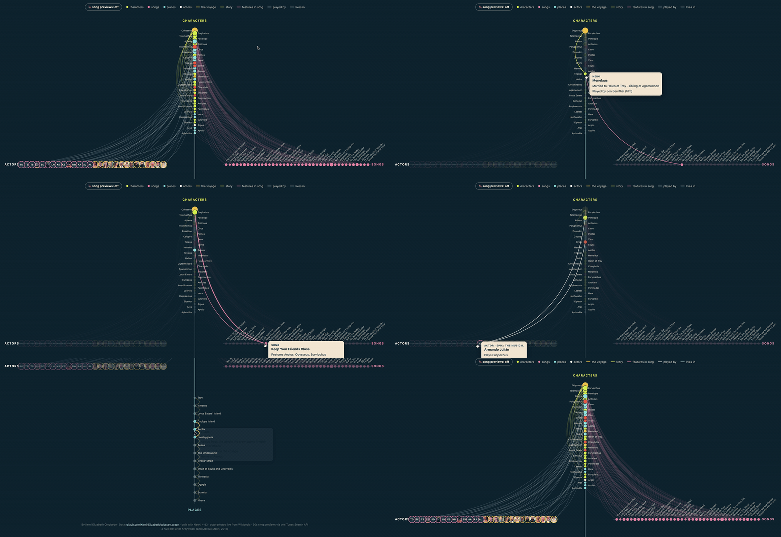
While a force-directed layout could look like this:
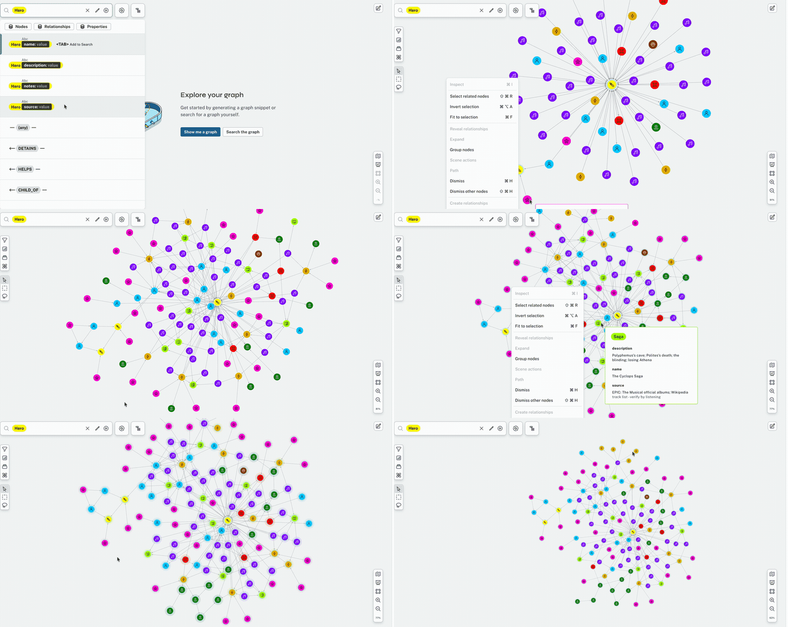
Force-directed layouts are great for seeing what clusters and gaps naturally emerge in your data. Hive plots are for when you want to control the structure yourself.
Using hive plots with Neo4j
Hive plots have history with Neo4j. Max De Marzi was drawing them back in 2012. They're built with d3.js, a JavaScript visualisation library that works beautifully with graph data, as projects like neo4jd3 show.
I already had a graph of the characters, songs, places and actors across the recent adaptations of Homer's Odyssey, so I built one of my own with nodes that play song previews from EPIC: The Musical on hover.
View the live hive plot here. Also, if you love musicals and Greek mythology, definitely turn the sound on.
I expected the process of adding interactivity to my graph data to be painful, but it actually wasn't, and I believe the reason comes down to four data modeling decisions I made before d3.js touched the project.
If you'd rather not watch me turn graph data into a hive plot step by step, skip straight to the modeling decisions that made the interactivity easy. Unlike Odysseus, you're allowed to take the direct route home.
Otherwise, read on.
Step 1: Model the story as a graph
In my data, I had characters, songs, places and actors, all connected by relationships that read like the story itself:
(polyphemus)-[:CURSES]->(odysseus)
(calypso)-[:DETAINS]->(odysseus)
(song {name: 'Love in Paradise'})-[:FEATURES]->(calypso)
(circe)-[:LIVES_IN]->(aeaea)
(troy)-[:TRAVELS_TO]->(ismarus)
(matt_damon)-[:PLAYS]->(odysseus)
Step 2: Export the graph for d3.js
I exported the graph into a list of nodes and a list of relationships by running these two queries in Aura:
MATCH (n)
RETURN n.name AS name,
       labels(n)[0] AS type,
toLower(labels(n)[0]) AS groupMATCH (s)-[r]->(o)
RETURN s.name AS s, o.name AS o, type(r) AS relCASE expression in the first query folds my specific labels (Hero, Mortal, Deity, Monster, Animal) into one character group. Think of it like using an if-else statement in Python. I then saved the results into a JSON file:
const data = {
  nodes: [
    { name: "Poseidon", type: "Deity", group: "character" },
    { name: "Love in Paradise", type: "Song", group: "song" },
    // ...
  ],
  links: [
    { s: "Polyphemus", o: "Odysseus", rel: "CURSES", cat: "story" },
    { s: "Love in Paradise", o: "Calypso", rel: "FEATURES", cat: "features" },
    // ...
  ],
};cat field, which was not produced by these queries, but decided by hand. Running the first query in Aura gives you one row per node, like this:
| name | type | group |
|---|---|---|
| Odysseus | Hero | character |
| Love in Paradise | Song | song |
| Ithaca | Place | place |
| Zendaya | Actor | actor |
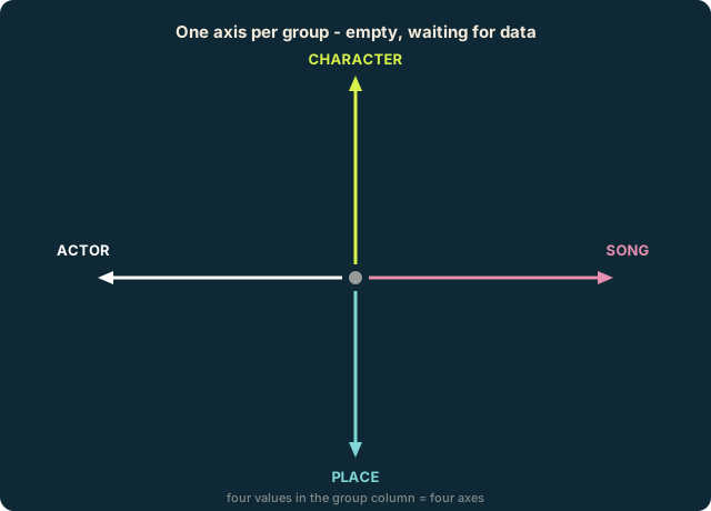
As shown in the table above, I have four groups in my data (character, song, place, actor) and these will become the axes in my hive plot.
The second query gives one row per relationship:
| Subject (s) | Object (o) | Relationship (rel) |
|---|---|---|
| Polyphemus | Odysseus | CURSES |
| Love in Paradise | Calypso | FEATURES |
| Troy | Ismarus | TRAVELS_TO |
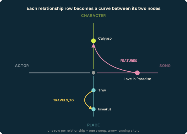
The structure is (s)-[:REL]->(o). For example: Odysseus → BLINDS → Polyphemus. These relationships will become the signature swoops in my hive plot.

Step 3: Turn your data into shapes
This is a single row from my nodes list:
{ name: "Odysseus", type: "Hero", group: "character" }It describes Odysseus as a character, who, specifically, is a hero (I know that's up for debate, but ignore it for now).
d3.js will then turn that row into this circle:
<circle cx="500" cy="140" r="14" fill="#d9f24b"></circle>The details of this circle were worked out using the following rules:
1. Every node label gets an axis
An axis is a straight line pointing outward from a shared centre. Mine point up (characters), right (songs), down (places) and left (actors):
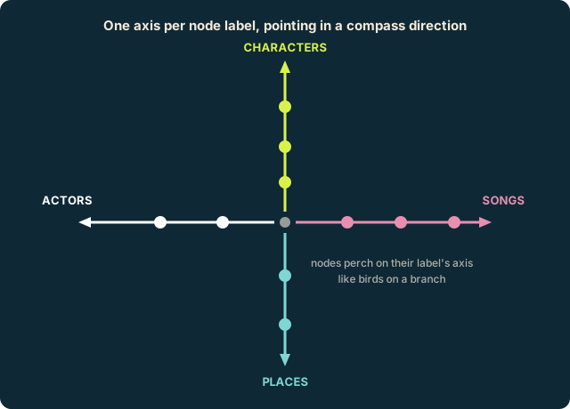
The group column from my data export is the only thing deciding which axis a node belongs to. For example, Odysseus has group: "character", so he goes on the up axis.
In my code, the axes are described like this:
const AXES = {
  character: { a: -Math.PI/2, r1: 640, label: "CHARACTERS", color: "#d9f24b" },
  song:      { a: 0,          r1: 830, label: "SONGS",      color: "#e88fb0" },
  place:     { a: Math.PI/2,  r1: 640, label: "PLACES",     color: "#7fd6d4" },
  actor:     { a: Math.PI,    r1: 830, label: "ACTORS",     color: "#ffffff" },
};

const ax = AXES[n.group];a is the direction each axis points (characters point straight up), r1 is how long it is in pixels. -Math.PI / 2 means "up". Math.PI means left, 0 means right, and Math.PI/2 means down. 2. Every node has its place on the axis
This idea is called a scale, and in the case of my hive plot, all my data points are kind of like birds perching evenly along their designated axes - characters, songs, actors and places.
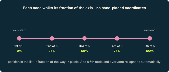
3. One row of data becomes one shape on screen
d3 takes each of your data points and creates a circle for them:
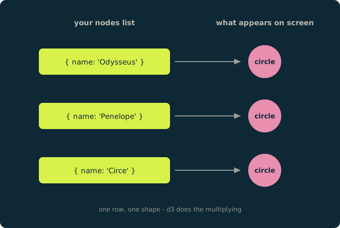
This process is called a data join, and in code, it's:
svg.selectAll("circle")   // "I'm about to talk about circles"
  .data(nodes)            // "here's my list of nodes - give me one circle per row"
  .join("circle")         // "do it"
Each circle also grows with the number of relationships that mention it, which is why Odysseus is enormous (he has a whopping 61 connections).
4. Curves bend toward the centre
Imagine the centre of a hive plot as a magnet, with each line coming out of it as a rubber band: the two ends stay pinned to their nodes, and the magnet pulls the middle of the rubber band inward.
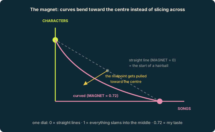
That bend is the hive plot's signature swoop, and it's controlled by a single number in my code, a dial I named MAGNET. 0 means straight lines, while 1 is super bent. I chose MAGNET = 0.72 just because it's the number that made my eyes happy.
Step 4: Add interactivity
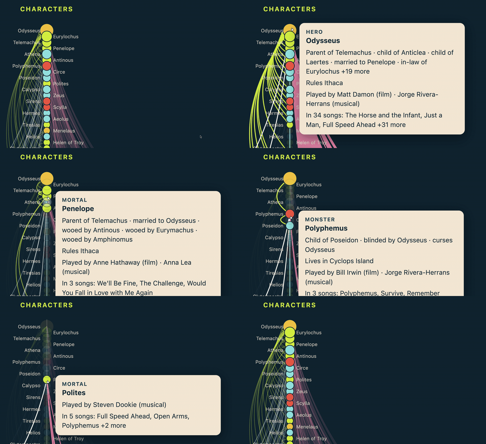
The interactive layer is my favourite part, not only because it's fun, but because every piece of it runs on four decisions I made while modeling the data. Here is each decision and how it paid off.
The four modeling decisions
1. I packed all the detail into my graph and simplified it during the export.
My dataset originally had specific labels like:
(:Hero    {name: "Odysseus"})
(:Deity   {name: "Calypso"})
(:Monster {name: "Polyphemus"})
(:Mortal  {name: "Clytemnestra"})
(:Animal  {name: "Argos"})
The hive plot only needed four broad groups though, so my export query folded all of the labels above into one mega group called character. That group became the character axis, while the original labels became extra detail for the tooltips.
Now, hovering over Clytemnestra gives you a little MORTAL title above her name, which is just her node's label being read straight from the original details I included in my data.
2. Relationships are made up of detailed verbs.
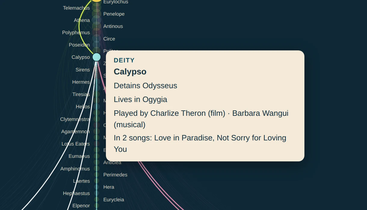
I chose specific verbs (e.g. CURSES, DETAINS, BLINDS, MENTORS) when describing relationships, which are shown in the tooltips. If every relationship had been a generic RELATED_TO, every tooltip would have read like "Polyphemus is related to Odysseus", which isn't as fun or detailed as "Polyphemus CURSES Odysseus".
Here's what that decision looks like in the graph:
3. Every relationship in my data has a clear direction.
When you hover over Telemachus, you get "child of Odysseus" and when you hover over Odysseus, you get "parent of Telemachus". All that took was a small phrasebook with each verb written out forwards and backwards, which was only possible because decision 2 gave me specific verbs to write phrases for:
const REL_FWD = { CURSES: "curses",    MENTORS: "mentors",      CHILD_OF: "child of"  };
const REL_REV = { CURSES: "cursed by", MENTORS: "mentored by",  CHILD_OF: "parent of" };

const info = {};   // one list of sentences per node name

data.links.forEach(l => {
  (info[l.s] ??= []).push(`${REL_FWD[l.rel]} ${l.o}`);
  (info[l.o] ??= []).push(`${REL_REV[l.rel]} ${l.s}`);
});
The alternative would have been storing both facts separately, which would have taken way more time and effort.
4. The voyage data is stored as a chain of hops.
My data reads like: Troy TRAVELS_TO Ismarus, Ismarus TRAVELS_TO the next place, and on down the line. I could have put stopNumber: 1, 2, 3 on each place instead, but with a chain you just follow the arrow, which makes the whole route one traversal. If I run this query:
MATCH voyage = (:Place {name: "Troy"})-[:TRAVELS_TO*..20]->(:Place {name: "Ithaca"})
RETURN [stop IN nodes(voyage) | stop.name] AS stops*..20 cap stops the database from trying every possible route between Troy and Ithaca. I get this result:
["Troy", "Ismarus", "Lotus Eaters' Island", "Cyclops Island", "Aeolia", "Laestrygonia", "Aeaea", "The Underworld", "Sirens' Strait", "Strait of Scylla and Charybdis", "Thrinacia", "Ogygia", "Scheria", "Ithaca"]In the plot, these are the gold curves hopping from node to node down the Places axis:
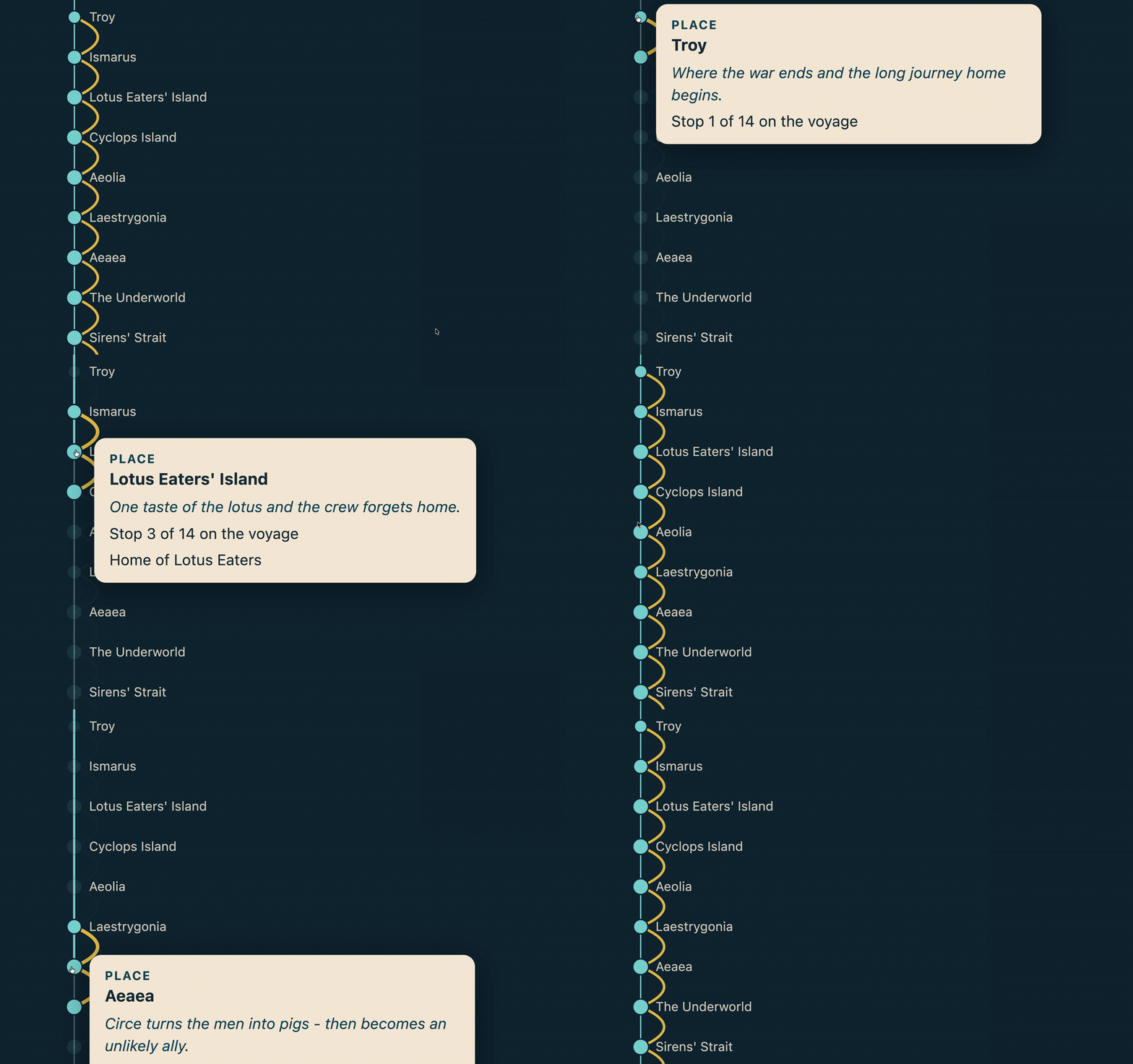
There's even a line in the tooltip that reads Stop ${n.pos + 1} of ${n.axisN} on the voyage - worked out purely from each place's position in
the chain.
Other bits of interactivity
The spotlight. If you hover over a node, everything unconnected to it fades to the background - the browser-side version of asking:
MATCH (:Deity {name: "Calypso"})--(neighbour)
RETURN collect(neighbour.name) AS neighbours
The toys. Actor nodes fetch their photos live from Wikipedia's public API, while song nodes fetch 30-second previews from the iTunes Search API. Because I love finding ways to make data more fun.
You can view the actual hive plot here.
And if you'd like to explore the graph data yourself, download the Odyssey data model using the button below.
You can import that straight into Aura using the Data Importer and the whole graph will build itself. All you'll have to worry about is querying it all.
The Odyssey data model, ready for Aura's Import tool:
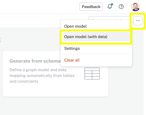
Download the model and open it using the Open model (with data) button in the ... menu.
And if you'd like to learn the skill this whole post is actually about:
Graph Data Modeling Fundamentals


Comments (0)
Loading comments...