In this lesson you will:
-
Explore visualization types in Aura Dashboards
-
Learn how to pick a visualization type for counts, averages, and distributions
The visualization type dropdown
You can change the Visualization type when adding or editing a card.
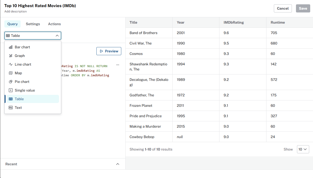
The data returned by your query often indicate what visualization type to choose:
| Use | When the query returns |
|---|---|
Graph |
Nodes and relationships |
Table |
Rows and columns |
Bar chart |
Categories and one numeric value per category |
Line chart |
An ordered dimension (year, genre, country, etc) and a value |
Pie chart |
Parts of a whole share |
Single value |
One row, one numeric column |
Text |
Markdown for context |
Visualization types
See Neo4j Aura Dashboards documentation for a complete list of visualization types and settings.
Explore the visualization types
Explore the following examples that use different visualization types. For each example:
-
Add a new card to your dashboard with an appropriate name.
-
Set the Visualization type as shown.
-
Update the query.
-
Review the result.
Table: top user ratings
Visualization type - Table.
MATCH (u:User)-[r:RATED]->(m:Movie)
RETURN m.title AS movie, u.name AS user, r.rating AS rating
ORDER BY r.rating DESC
LIMIT 10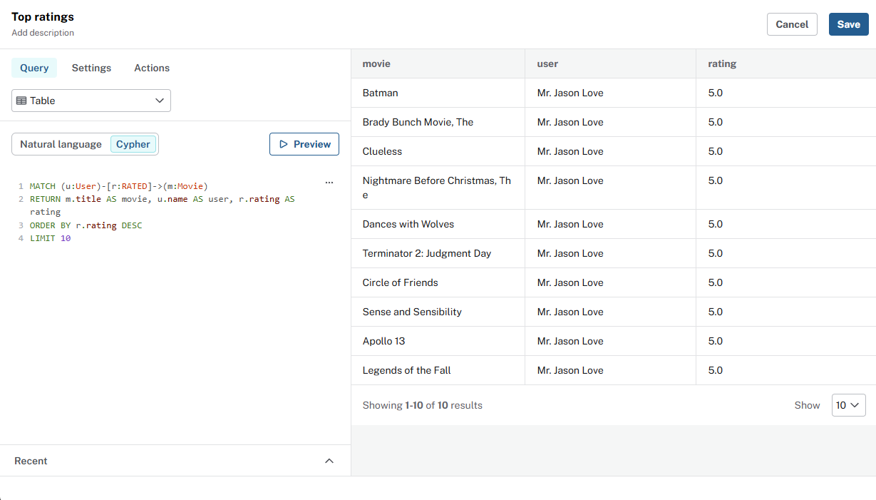
Bar chart: average IMDb by genre
Visualization type - Bar chart.
MATCH (m:Movie)-[:IN_GENRE]->(g:Genre)
WHERE m.imdbRating IS NOT NULL
RETURN g.name AS genre, round(avg(m.imdbRating), 2) AS avg_imdb
ORDER BY avg_imdb DESC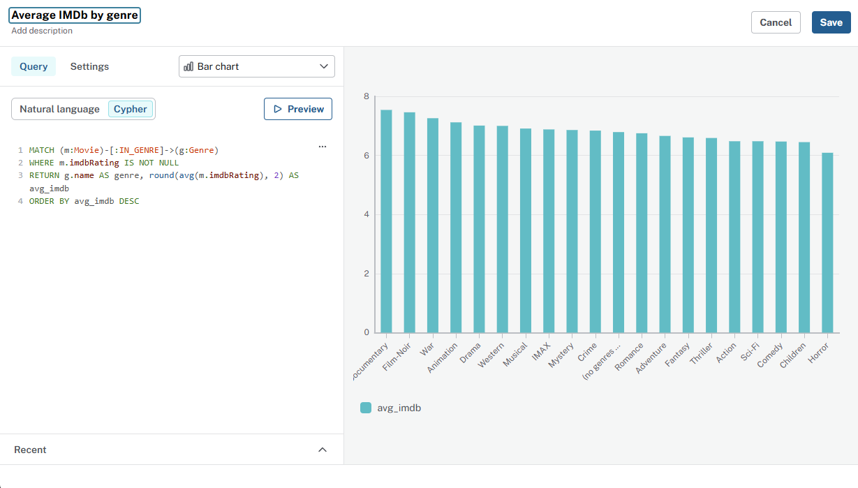
Single value: total movies
Visualization type - Single value.
Single value cards are ideal for totals and other aggregations that return one number.
MATCH (m:Movie)
RETURN count(m) AS total_movies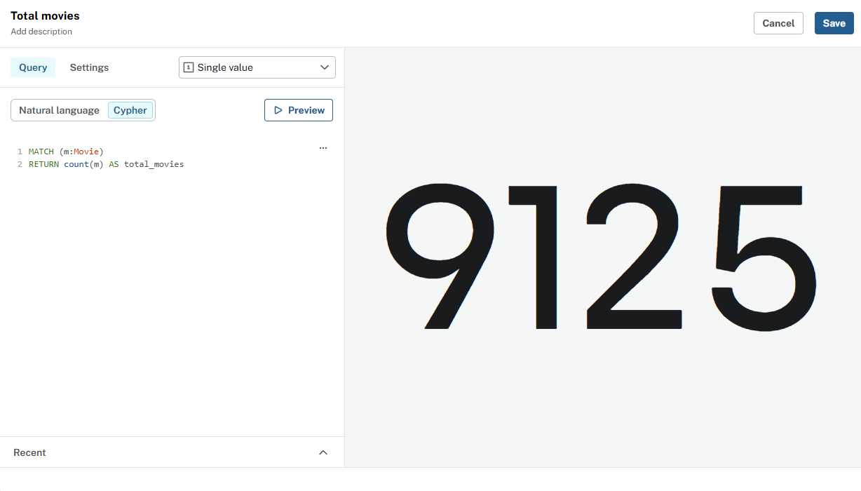
Aggregations
Experiment with the count(), avg(), and sum() aggregation functions in Cypher to return a single value.
Text: dashboard context
The Text visualization type is ideal for dashboard context and explanations. You can format text as markdown, adding titles, bullets, and links to the text.
Visualization type - Text.
## Movie recommendations

The movies recommendation dataset contains data relating to movies, actors, directors, genres, and user's movie ratings.

### Data model

```
(:Person)-[:ACTED_IN]->(:Movie)
(:Person)-[:DIRECTED]->(:Movie)
(:User)-[:RATED]->(:Movie)
(:Movie)-[:IN_GENRE]->(:Genre)
```

### Source
The data was taken from [IMDB](https://www.imdb.com/).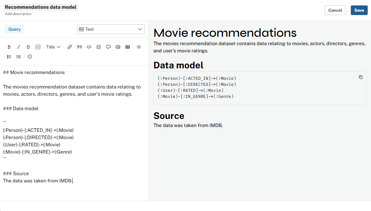
Access and security
Dashboard viewers only see data their role allows. If a role cannot read certain nodes, those rows do not appear in the card.
Add new cards to your dashboard and explore the different visualization types.
Check your understanding
Visualizing aggregated metrics for recommendations
You want to see which genres have the most movies. Instead of listing every movie, you want a count per genre. What is the benefit of visualizing this aggregated data?
-
❏ To see every individual movie record in detail
-
✓ To identify trends and patterns in genre popularity that help with content recommendations
-
❏ To export raw movie data for external analysis
-
❏ To generate random visualizations for testing
Hint
Aggregated data, such as counts, averages, and sums, summarizes data so you see patterns that are not obvious from individual rows. For example, which genres have the most movies.
Solution
To identify trends and patterns in genre popularity that help with content recommendations.
Aggregations, such as movies per genre or average rating by genre, reveal trends you cannot see from raw rows. Use them to choose chart types and answer questions like "Which genres are most common?"
Summary
In this lesson, you matched Visualization type to query result and explored different visualizations.
Next: who gets to see the dashboard, and how invites work in Aura.